ISIN INF740K01PR3
Overall analysis
3-yr rolling excess returns is in the range of negative 5-1% and tracking error against benchmark also have been in the range of 3-5% and the funds’ performance in the short run has been deteriorating. The fund had not given the maximum excess return in comparison to its peers.
Performance analysis
Rolling returns in quartiles
The rolling return chart shows excess 3-year annualised returns in context of peer return quartiles. The blue line’s time above the third green median line indicates the fund’s better than median performance.
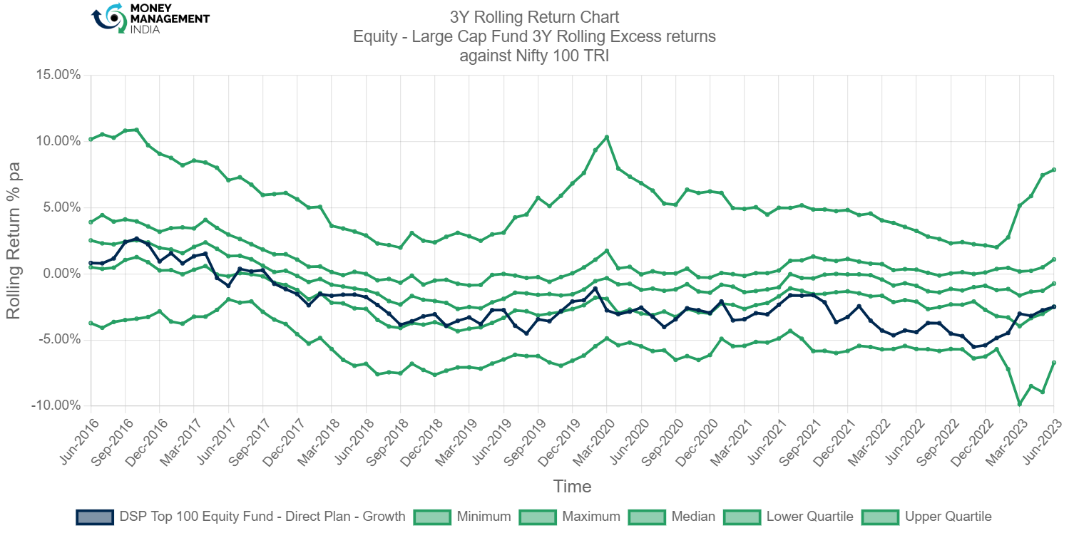
The rolling returns of the fund is below the third green median line which means it is not better than median performance so this fund is not good for investing.
Rolling risk/return (Snail-trail)
The rolling risk/return chart shows excess 3-year annualised returns relative to the index. The top left quadrant would indicate higher returns with lower volatility than index.
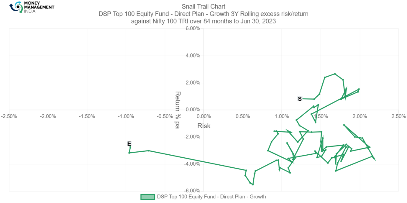
The fund has a negative return most of the time so it is not good for the fund so it’s not good for investing.
Tracking error
The tracking error chart shows how the fund ‘tracks’ against the index. The higher the TE, the more active the fund’s return has been, with the 2-4% range considered to be barely active, 4-6% range considered to be reasonably active and anything higher attributed to concentrated/focused funds. Funds with TE of less than 2% can be considered to be closet indexers.
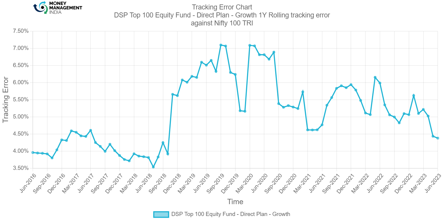
Tracking error of the fund was around 4% in June 2016 but has also gone up till 7% in between September 2018 and right now it has come down around 4.50% in June 2023.
Information ratio
The information ratio is a measure of ‘risk-adjusted return’ as it’s the excess return per unit of excess volatility. Active funds should have IR of higher than 1, ideally higher than 1.3 at least to indicate skill.

The information ratio of the fund has gone negative between September 2016 to September 2019 but then has gone to positive side upto 1.7 which is ideal.
Portfolio analysis
Stock style chart
Morningstar’s stock style chart shows the ‘style’ of the stocks in the portfolio in terms of size and value/growth style. The centroid shows the weighted average while the zone circle shows how varied the stock styles are.

The style chart of the fund shows a typically growth oriented fund in the large cap segment.
Factor profile chart
Morningstar’s factor profile shows the historical style analysis of the stocks in the portfolio in terms of size, value/growth style and other key factors. The blue circle shows the fund relative to the black dot for the category average.
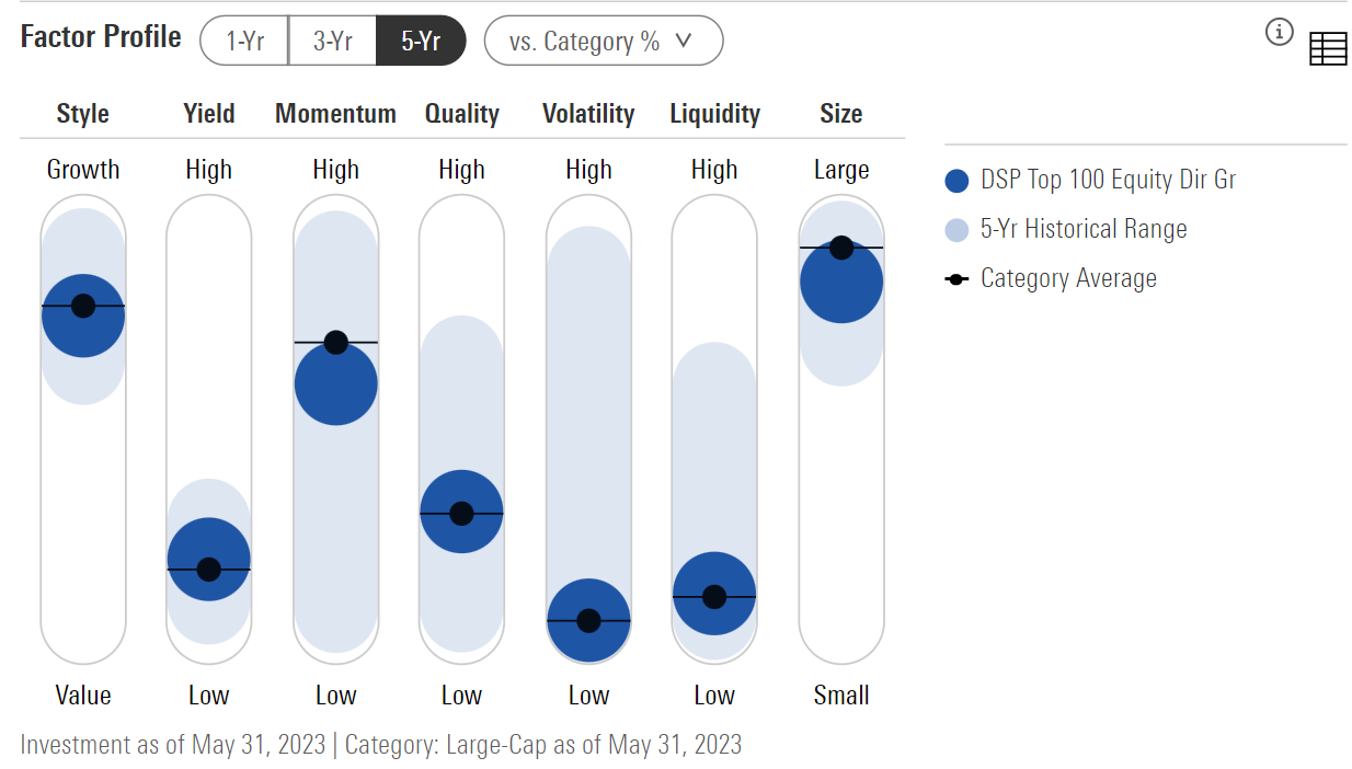
The factor profile chart shows that the yield of the fund is low and momentum & quality of the fund is moderate and Volatility & Liquidity is low and size of the fund is large over the last 5 yrs historical range.
Prepared by – Shreyas Walve, August 2023
You must be logged in to post a comment.