ISIN INF903JA1JC0
Overall analysis
3-yr rolling excess returns is not good if compared to peers and even TE against benchmark have also not been good overall; and the fund has not given the maximum excess return in comparison to its peers.
Performance analysis
Rolling returns – 3yr rolling excess returns over 7 years
Snail trail – 3y rolling excess over 7yrs
Tracking error – 1yr rolling over 7yrs
Information ratio – 1yr rolling over 7yrs
Rolling returns in quartiles
The rolling return chart shows excess 3-year annualised returns in context of peer return quartiles. The blue line’s time above the third green median line indicates the fund’s better than median performance.
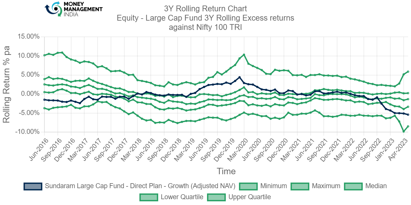
The funds rolling return chart shows that the fund has not performed quite well, and is below the lower quartile.
Rolling risk/return (Snail-trail)
The rolling risk/return chart shows excess 3-year annualised returns relative to the index. The top left quadrant would indicate higher returns with lower volatility than index.

The snail trail chart is not great, but is in harmless section of the chart. The fund has almost always been in the negative excess return with negative risk. Though negative excess return is not a great result for a MF, but at least the fund has not taken any risk for it.
Tracking error
The tracking error chart shows how the fund ‘tracks’ against the index. The higher the TE, the more active the fund’s return has been, with the 2-4% range considered to be barely active, 4-6% range considered to be reasonably active and anything higher attributed to concentrated/focused funds. Funds with TE of less than 2% can be considered to be closet indexers.

TE of the fund has been between 2-5% throughout and then had a drastic fall to 0.
Information ratio
The information ratio is a measure of ‘risk-adjusted return’ as it’s the excess return per unit of excess volatility. Active funds should have IR of higher than 1, ideally higher than 1.3 at least to indicate skill.
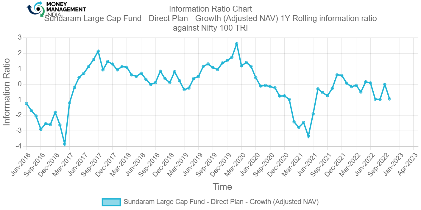
The information ratio of the fund shows a good progress in 2017-2019 but then now it is not that ideal.
Portfolio analysis
Stock style chart
Morningstar’s stock style chart shows the ‘style’ of the stocks in the portfolio in terms of size and value/growth style. The centroid shows the weighted average while the zone circle shows how varied the stock styles are.

The Stock Style of the fund shows the weight where the fund has invested in. Like this fund has majorly invested in the Growth segment.
Factor profile chart
Morningstar’s factor profile shows the historical style analysis of the stocks in the portfolio in terms of size, value/growth style and other key factors. The blue circle shows the fund relative to the black dot for the category average.

The factor profile chart shows that the fund style is growth, yield compared to 5 years historical range and category average is very low, momentum and quality of the fund is moderately high, volatility is low, liquidity of the fund is low compared to historical range and fund size large.
Prepared by – Shreya Mishra, August 2023.
You must be logged in to post a comment.