INF740K01PI2
Overall analysis
The 3-yr rolling excess return tracking error against benchmark has been good overall. All time this fund gives average return and only sometimes it was going more than 5%, so, this fund is good for investment.
Performance analysis
Rolling return in quartiles
The rolling return chart shows excess 3-year annualised returns in context of peer return quartiles. The blue line’s time above the third green median line indicates the fund’s better than median performance.

When the fund was started at that time, it was giving good returns. After December 2017 the fund was facing so many ups and downs, and currently the fund was giving negative returns.
Rolling Risk/return (snail-trail)
The rolling risk/return chart shows excess 3-year annualised returns relative to the index. The top left quadrant would indicate higher returns with lower volatility than index.
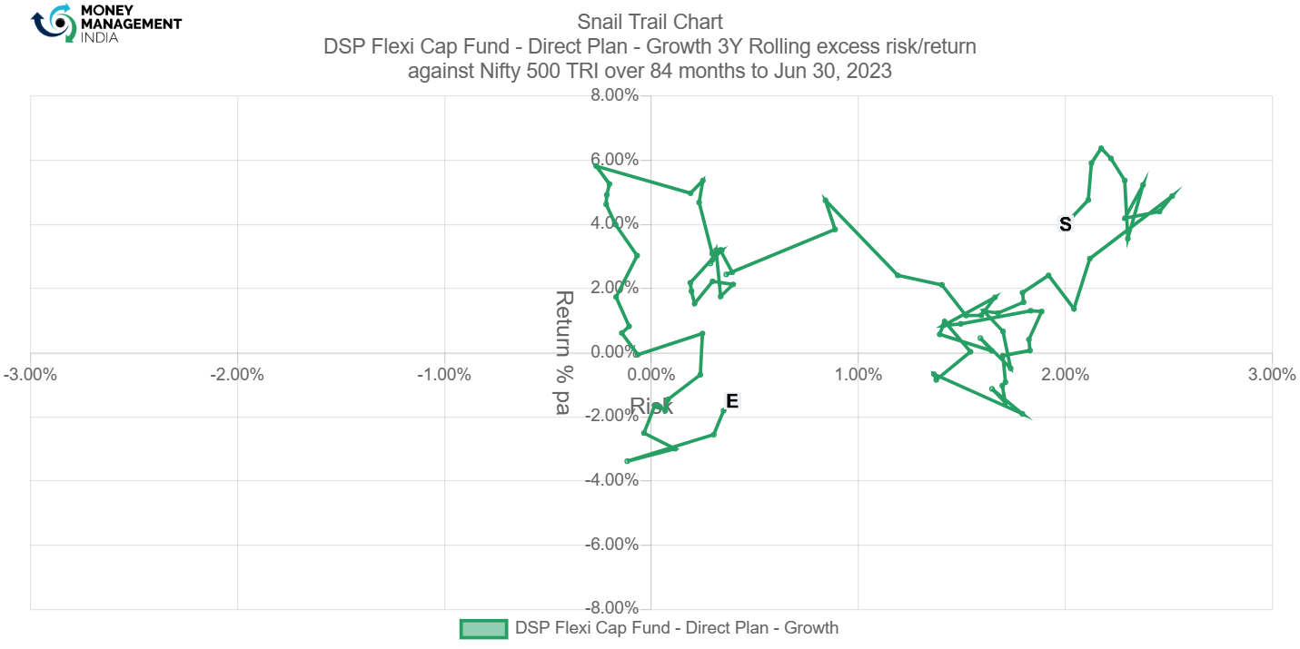
The snail Trail chart shows the major part of the fund was in the top right part only some minor part was in the negative area so it is a positive indicator for the fund.
Tracking error
The tracking error chart shows how the fund ‘tracks’ against the index. The higher the TE, the more active the fund’s return has been, with the 3-6% range considered to be barely active, >6% range considered to be reasonably active and anything higher attributed to concentrated/focused funds. Funds with TE of less than 3% can be considered to be closet indexers.
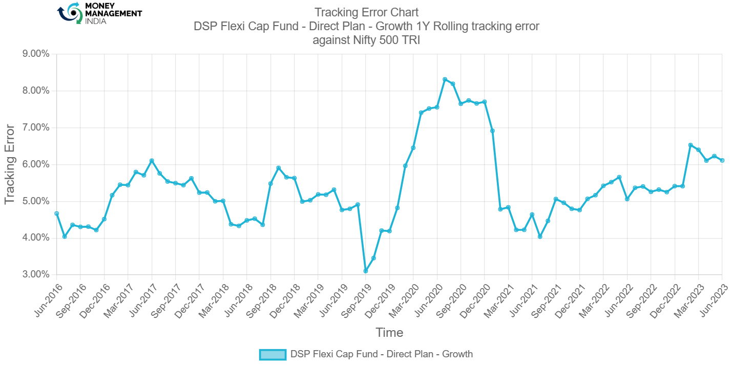
1 year rolling tracking error shows that most of the time the fund was above 4%, so it was an active fund, a positive sign for the fund.
Information ratio
The information ratio is a measure of ‘risk-adjusted return’ as it’s the excess return per unit of excess volatility. Active funds should have IR of higher than 1, ideally higher than 1.3 at least to indicate skill.
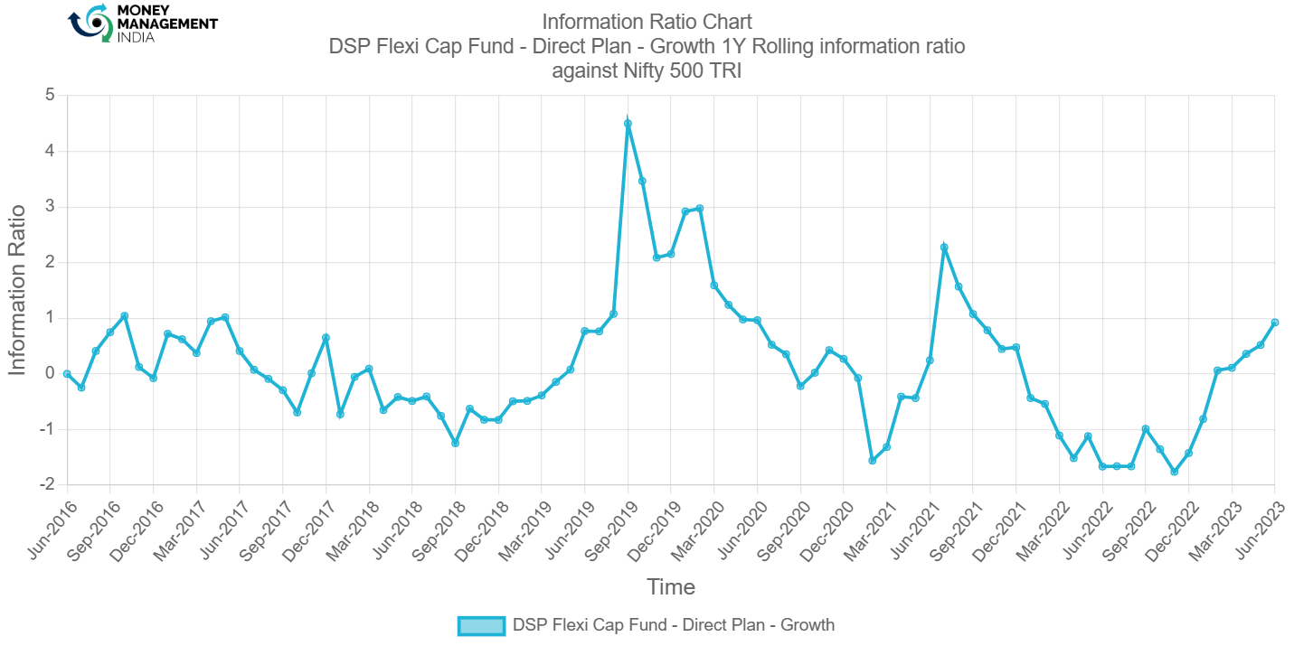
Information ratio Show the fund was under 1, only August 2019 to May 2020 was going above 1 so it was not a positive sign.
Portfolio analysis
Stock style chart
Morningstar’s stock style chart shows the ‘style’ of the stocks in the portfolio in terms of size and value/growth style. The centroid shows the weighted average while the zone circle shows how varied the stock styles are.
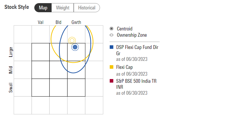
This Fund was a large cap growth fund.
Factor profile chart
Morningstar’s factor profile shows the historical style analysis of the stocks in the portfolio in terms of size, value/growth style and other key factors. The blue circle shows the fund relative to the black dot for the category average.
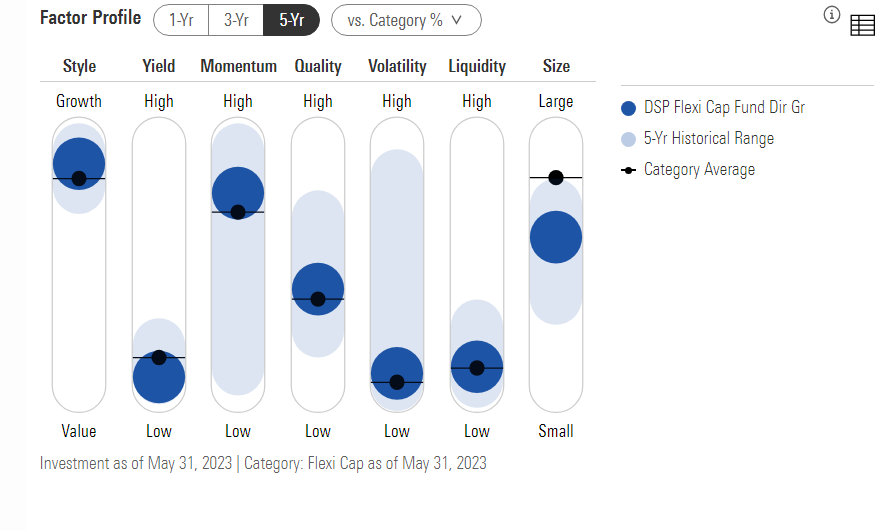
This fund was a high growth fund. The fund has low volatility compared to 5 years of historical range and the fund was medium size compared to category average.
Prepared by – <Nisarg Patel>, August 2023
You must be logged in to post a comment.