INF846K01B28
Overall analysis
The 3-yr rolling excess return tracking error against benchmark has been bad overall. Starting Days of this fund was good after some time the fund started to come down and currently in negative. This fund was not good for investment.
Performance analysis
Rolling return in quartiles
The rolling return chart shows excess 3-year annualised returns in context of peer return quartiles. The blue line’s time above the third green median line indicates the fund’s better than median performance.
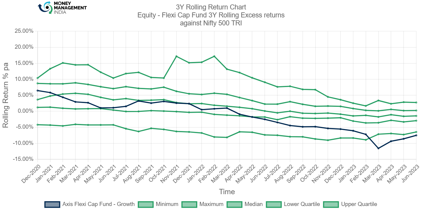
When the fund was started it was doing good and after sometime this axis flexi cap fund was going from upside to downside and on March 2023 this fund touched -11.59%. Currently the Blue line crossed the median line and it was in negative.
Rolling Risk/return (snail-trail)
The rolling risk/return chart shows excess 3-year annualised returns relative to the index. The top left quadrant would indicate higher returns with lower volatility than index.
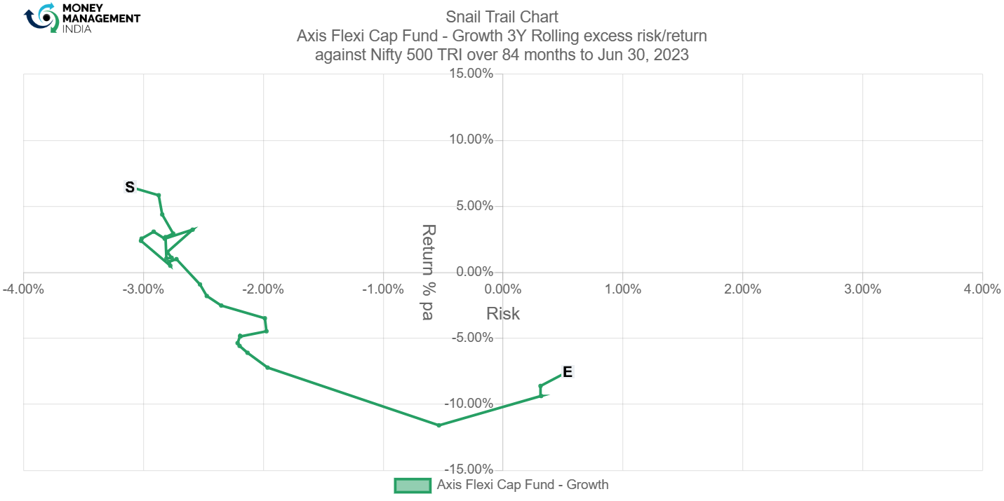
If you see the snail trail chart it clearly shows the fund was going upside to downside. On June 2021 fund was touched to 5.84% and on march 2023 fund was touched to -11.59%,
Tracking error
The tracking error chart shows how the fund ‘tracks’ against the index. The higher the TE, the more active the fund’s return has been, with the 3-6% range considered to be barely active, >6% range considered to be reasonably active and anything higher attributed to concentrated/focused funds. Funds with TE of less than 3% can be considered to be closet indexers.

The Tracking Error fund has been good between February 2020 to 2021 after this time it was again close to the index.
Information ratio
The information ratio is a measure of ‘risk-adjusted return’ as it’s the excess return per unit of excess volatility. Active funds should have IR of higher than 1, ideally higher than 1.3 at least to indicate skill.
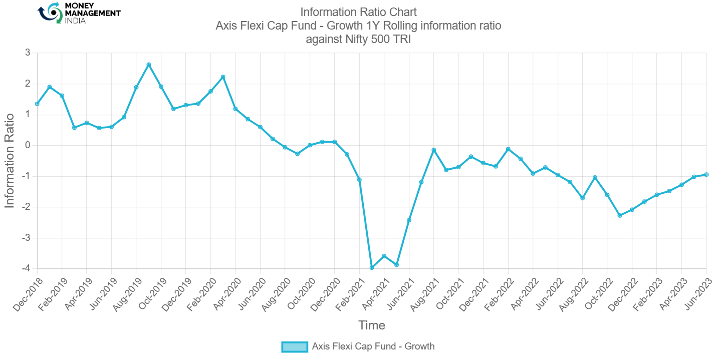
The Information Ratio of the fund was good. April 2021 once it was going down and again it came back to the upside.
Portfolio analysis
Stock style chart
Morningstar’s stock style chart shows the ‘style’ of the stocks in the portfolio in terms of size and value/growth style. The centroid shows the weighted average while the zone circle shows how varied the stock styles are.
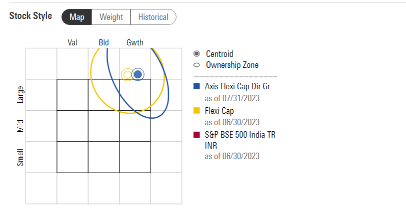
This fund was a large cap growth fund. It was good for investment.
Factor profile chart
Morningstar’s factor profile shows the historical style analysis of the stocks in the portfolio in terms of size, value/growth style and other key factors. The blue circle shows the fund relative to the black dot for the category average.

This chat shows that this fund was a high growth large cap fund. And the fund has high momentum compared to category average. If you see the 5 years of historical range of this fund, volatility is currently very low.
Prepared by – Nisarg Patel, August 2023
You must be logged in to post a comment.