
There are a number of attractive mutual funds and fund managers that have performed well over both long-term and short-term horizons. All mutual funds have a stated investment mandate that specifies whether the fund will invest in large companies or small companies, and whether those companies exhibit growth or value characteristics. It is assumed that the mutual fund manager will adhere to the stated investment objective. It’s a good start to understand the fund’s specific investment mandate, but there is more to fund performance that can only be revealed by digging a bit deeper into the fund’s portfolio over time.
Fund managers typically use terminologies like value, growth funds; top-up, bottom down approach however, in order to find evidence that fund managers adhere to their said investment philosophy and whether they consistently add value to active funds by providing the desired alpha – we need to analyse both performance and holdings of the fund. We know, past performances are not indicative of future returns, however, past performances help us in Quantitative analysis and when combined with Qualitative analysis done by Financial Analysts, we can better understand the quality and consistency of a fund, thus make better investment decisions.
The aim of this paper is to intuitively explain the various measures and their scope used to quantitatively analyse a mutual fund – how can one use these measure to evaluate a fund and what are the shortcomings of each measure.
A fund’s portfolio analysis can be divided into two parts:
- Performance-based analysis – Techniques that performance analysts use to explain why a portfolio’s performance differed from the benchmark. It helps to assess the quality of the investment approach.
- Portfolio or holdings-based analysis – It is a bottom‐up approach in which the characteristics of a fund over a period of time are derived from the characteristics of the securities it contains at various points in time over the period.
Performance or NAV-based analysis
Performance based analysis used the NAV of mutual funds to determine risk and returns.
Returns only –
Cumulative returns or Growth chart
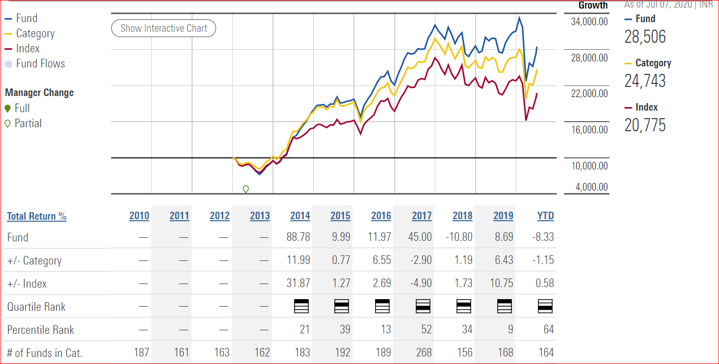
*Source: Morningstar
- The Growth of ₹10,000 graph shows a fund’s performance (blue line) based on how ₹10,000 invested in the fund would have grown over time. Returns used in the graph are not load-adjusted ie adjusted for any upfront fees or costs.
- The growth of ₹10,000 begins at the date of the fund’s inception, or the first year listed on the graph, whichever is appropriate. A line represents the growth of ₹10,000 invested in the benchmark index (red line) and another line represents the growth of ₹10,000 invested in fund’s Morningstar category (yellow line). These lines allow investors to compare the performance of the fund with the performance of a benchmark index and the fund’s Morningstar category. Both lines are plotted on a logarithmic scale, so that identical percentage changes in the value of an investment have the same vertical distance on the graph.
Period or trailing returns
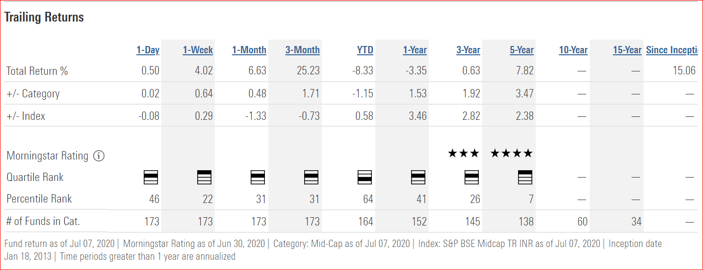
- Trailing return is the return that the mutual fund has achieved over the specified time period, including both capital gains and dividend growth. It looks backward from a particular date for a fund’s annualized return over a specific time period – usually ending on the last day of the most recent day, month, quarter, or year.
- It is determined by looking at the Net Asset Value of a mutual fund (the price) at the beginning of the time period compared to the end of the time and then determining the percentage change.
- When looking at the category average we try to determine how a particular fund is performing compared to other funds. For example, in the given chart, the 3yr trailing return for the category average is 1.92% but the fund under consideration has a return of 0.63%, you may want to keep looking in that category for a better fund.
- When looking at the trailing return compared to the index we try to determine if the fund can outperform the index. If it cannot it may be better to invest in an index mutual fund following that index. The costs are cheaper so if the returns are the same there may not be a compelling reason to invest in the managed fund.
Quartile rank
- It measures how well the fund has performed against all the funds in the category.
- Highest percent returns in the chosen time period are assigned to “Top Quartile”, whereas those with the lowest returns are assigned to “Bottom Quartile”
- Funds in the top 25% are assigned the ranking of “Top Quartile” (top most shaded area), the next 25% are assigned a ranking of “Upper Middle Quartile”, the next 25% after that are assigned a ranking of “Lower Middle Quartile” and the lowest 25% are assigned the ranking of “Bottom Quartile” (Bottom most shaded area)
- While, the current quartile ranking of a mutual fund scheme is important, what is even more important, is the consistency of quartile ranking across several quarters.
Percentile rank
- Percentile rank is a standardized way of ranking items within a peer group, in this case, funds with the same Morningstar category.
- The observation with the largest numerical value is ranked one; the observation with the smallest numerical value is ranked 100. The remaining observations are placed equal distance from one another on the rating scale.
- Thus, lower percentile ranks are generally more favourable for returns (high returns), while higher percentile ranks are generally more favourable for risk measures (low risk).
- Percentile ranks within categories are most useful in those categories that have a large number of funds. For small universes, funds will be ranked at the highest percentage possible.
Returns and risk –
Risk and return analysis
Risk means standard deviation
SD measures the range of the fund’s performance. Standard deviation is the tool used to evaluate the volatility in the fund’s returns relative to its average. That is, it states the deviation of funds return from the historical average returns of the fund.
Calculation
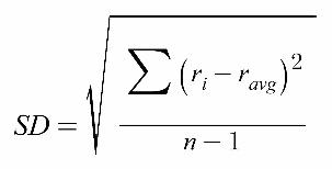
Ri – the return observed in one period (one observation in the data set)
Ravg – the arithmetic mean of the returns observed
n – the number of observations in the dataset
How to interpret?
- As the SD increases, so does the risk, which means that your investment has a chance to move either up or down in a much wider band than an instrument with a low SD.
Example: if an equity fund has given 15% returns on an average with an SD of 20 percentage points, its range of return can vary from -5% to 35%.

*Source: Morningstar
*Funds with less than 3 years of performance history are not rated.
Risk vs. Category
It is an assessment of the variations in a fund’s monthly returns in comparison to similar funds. The greater the variation – Larger the risk score. Example: The given chart suggests that the fund’s is risker than it’s peers since the variation in the monthly returns of the fund id more than the average variation in the monthly returns of the similar funds.
Return vs. Category
It is an assessment of the fund’s excess return over a risk-free rate in comparison to similar funds. Risk-free rate used is the return of the 90-day T-bill. The greater the variation – Larger the risk score. Example: The given chart suggests that the fund is risker than its peers since the variation in the monthly returns of the fund is more than the average variation in the monthly returns of the similar funds.
Return/ Return Chart
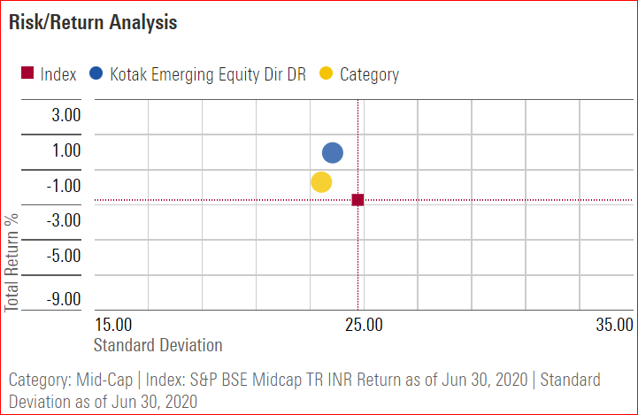
*Source: Morningstar
In the above chart, the X-axis shows Standard deviation (SD) while Y-axis shows Total returns (%). The red box indicates that the Index(S&P BSE Midcap) gave a negative of 2% with a SD of 25%. The peer funds gave a negative return of 1% with a SD close to that of the benchmark index.The fund under analysis clearly performed better in comparison to the benchmark index and its peer funds by giving a positive return close to 1% with almost equal SD.
Combining returns and risk into single ratios –

*Source: Morningstar
Beta
Beta is the measure of a fund’s sensitivity to market movements. A beta coefficient can measure the volatility of an individual stock compared to the systematic risk of the entire market.
Calculation
A security’s beta is calculated by dividing the product of the covariance of the security’s returns and the market’s returns by the variance of the market’s returns over a specified period.
Beta = Covariance (Ri, Rm)
Variance (Rm)
Ri: Return on underlying portfolio
Rm: Return on benchmark
How to interpret?
- By definition, the beta of the market is 1.00
- A beta > 1: Investment is more volatile than the market.
- A beta < 1: Investment is less volatile than the market.
Example: In the given chart,
Beta of the fund > Beta of the category > Beta of Index suggest that – The fund is more volatile than its peer funds and also the index used as a benchmark.
Why is it used?
- It helps to understand whether a stock moves in the same direction as the rest of the market.
- It also provides insights about how volatile–or how risky–a stock is relative to the rest of the market.
Alpha
Alpha is a measure of an investment’s performance on a risk-adjusted basis. It takes the volatility (price risk) of a security or fund portfolio and compares its risk-adjusted performance to a benchmark index. It is often considered the additional return that an active manager generates over and above what might be anticipated given the level of investment risk taken.
Calculation
Alpha= Ri – Rf – beta (Rm-Rf)
Ri: Portfolio return
Rf: Risk-free rate of return
Beta: Systematic risk of a portfolio
Rm: Market return, per a benchmark
How to interpret?
Considering Alpha of the market as 0
- Alpha = +ve: Fund returned more than what you’d expect given its Beta.
- Alpha = 0: Fund has given same returns as the market.
- Alpha = -ve: Fund has fund returned less than what you’d expect given its beta.
Example:
In the given chart,
Alpha (fund) = 2.37 indicating that the fund has outperformed the market by 2.34%
However, the alpha (category) is only 0.42% while alpha (index) is -5.52% indicating that the fund has outperformed the index by 7.89%
Why is it used?
- Alpha attempts to show whether a fund has adequately compensated investors for its volatility level, as reflected by its beta.
- For example, a high-beta fund might have experienced extreme performance generations relative to its benchmark. But only if its returns have been even higher than its beta would predict, the fund has generated positive alpha.
R2
R-squared is the statistical tool used to determine the relationship between portfolio and its index. R2 reflects the percentage of the funds movements that are explained by movements in its benchmark index.
Calculation
- R-squared is calculated by squaring the correlation, where correlation is division of covariance between index and the portfolio and standard deviation of both index and portfolio.
R = Covariance (Ri, Rm)
SD(Ri) SD(Rm)
Ri: Return on underlying portfolio
Rm: Return on benchmark
How to interpret?
- R-squared is reported as a number between 0 and 100.
- 1<R2<0.4 = Low correlation between portfolio and index returns
- 0.4<R2 < 0.7 = Average correlation between portfolio and index returns
- R2 > 0.7 = Good correlation between portfolio and index returns
- indicates a more significant beta figure.
Example:
In the given chart, R2= 95.37 which indicates a high correlation between the benchmark index and the fund under consideration.
Why is it used?
- Significance of beta depends on R2
- If R2 <0.4, it indicates that there is very less correlation between the benchmark index and fund, hence beta which measures the volatility of a fund compared to the index will not be significant.
- Similarly as alpha is dependent on beta, low beta significance will also lead to low alpha significance.
Sharpe ratio
The Sharpe ratio adjusts a portfolio’s past performance—or expected future performance—for the excess risk that was taken by the investor. The ratio is the average return earned in excess of the risk-free rate per unit of volatility in the portfolio This measure determines how the return of the scheme has compensated an investor for the risks it has taken.
Calculation
Sharpe Ratio = Ri – Rf
SD(p)
Ri =return of portfolio
Rf =risk-free rate
SD(p) =standard deviation of the portfolio’s excess return
How to interpret?
- As a rule of thumb, a ratio of 1 and above is good, 2 and above is very good and 3 and above is excellent. It is advisable to look at this ratio over several periods to assess how the funds have fared in different market cycles.
- A high Sharpe ratio is good when compared to similar portfolios or funds with lower returns.
Example: Risk free rate = 4%
Fund X – Returns= 8%, SD = 4%, Sharpe ratio = 1
Fund Y – Returns= 10%, SD = 8%, Sharpe ratio = 0.75
Based on returns – Fund Y is better performer
Based on risk-adjusted returns – Fund X is better performer
Why is it used?
- It helps investors understand the return of an investment compared to its risk.
- It tells investors whether an investment’s returns are due to wise investment decisions or the result of excess risk.
- The Sharpe ratio has several weaknesses, including an assumption that investment returns are normally distributed and standard deviation is equal to risk.
Tracking error
- Tracking error is the difference in actual performance between a fund’s position and its corresponding benchmark.
- The tracking error can be viewed as an indicator of how actively a fund is managed and its corresponding risk level.
Calculation
- Tracking error is the standard deviation of the difference between the returns of an investment and its benchmark. Given a sequence of returns for an investment or portfolio and its benchmark, tracking error is calculated as follows:
Tracking Error = Standard Deviation (Portfolio return – Benchmark return)

*Source: iRate
How to interpret?
- Moderate – Necessary as the manager seeks to add Alpha by taking active positions.
- Very low – The manager is less likely to generate Excess Returns as the product appears similar to its benchmark.
- High – Tracking Error indicates that the manager seeks Alpha at the expense of higher relative risk.
- For passive products tracking Error should be minimal as the investment seeks to track the benchmark as closely as possible.
When to use it?
- May provide insight into the level of benchmark risk control the manager may demonstrate in the future.
- It shows an investment’s consistency versus a benchmark over a given period of time.
Information ratio
The information ratio (IR) is a measurement of portfolio returns beyond the returns of a benchmark, compared to the volatility of those returns. The IR is often used as a measure of a portfolio manager’s level of skill and ability to generate excess returns relative to a benchmark, but it also attempts to identify the consistency of the performance by incorporating a tracking error, or standard deviation component into the calculation.
Calculation
- To calculate subtract the total of the portfolio return for a given period from the total return of the tracked benchmark index. Divide the result by the tracking error.
IR = Portfolio return- Benchmark return
Tracking error

*Source: iRate
How to interpret?
- A higher IR result implies a better portfolio manager who’s achieving a higher return in excess of the benchmark, given the risk taken.
- Generally,
0.4 < IR < 0.6 – Good investment,
0.61 < IR < 1 – Great investment.
When to use?
- It tests whether a manager has beaten the benchmark by a large margin in a few months or by small margins every month.
- Although compared funds may be different in nature, the IR standardizes the returns by dividing the difference in their performances, known as their expected active return, by their tracking error.
- The Sharpe Ratio simply tells us how much we are compensated for taking risks, while the Information Ratio tells the investor the rewards the fund manager generated by deviating from the benchmark.”
Treynor ratio
- Risk in the Treynor ratio refers to systematic risk as measured by a portfolio’s beta- that is, the sensitivity of the portfolio’s returns to movements in the market—to judge risk. Beta measures the tendency of a portfolio’s return to change in response to changes in return for the overall market.
- The Treynor ratio, also known as the reward-to-volatility ratio, is a performance metric for determining how much excess return was generated for each unit of risk taken on by a portfolio.
- Excess return in this sense refers to the return earned above the return that could have been earned in a risk-free investment.
Calculation
Treynor ratio = Portfolio return- Risk-free rate
Beta of portfolio
How to interpret?
- If a portfolio has a negative beta, the ratio result is not meaningful.
- A higher Treynor ratio means a portfolio is a more suitable investment.
Why to use?
- Treynor ratio attempts to measure how successful an investment is in providing compensation to investors for taking on investment risk.
- The Treynor ratio is similar to the Sharpe ratio, although the Sharpe ratio uses a portfolio’s standard deviation to adjust the portfolio returns.
Upside ratio (UR)
- Measures the fund’s performance in the up markets relative to the index.
Calculation
- It is calculated by taking the fund’s monthly return for those time periods when its benchmark has posted positive returns and dividing the fund’s return by the benchmark’s return in the same month.
UR = Fund’s monthly returns when benchmark returns are positive
Benchmark’s return
How to interpret?
- UR> 100: Fund outperformed the benchmark during periods of positive benchmark returns.
- UR< 100: Fund underperformed the benchmark during periods of positive benchmark returns.
- UR close to 100 and above is desirable

*Source: Morningstar
Example: In the chart given,
UR of fund = 93, UR of category = 88
This suggests that when the benchmark returns were positive, the fund’s positive returns underperformed.
However, the fund performed better than it’s peers.
When to use?
- It helps to understand whether a given fund has outperformed–gained more or lost less than–a broad market benchmark during periods of market strength and weakness, and if so, by how much.
Downside ratio (DR)
- Measures the fund’s performance in the down markets relative to the index.
Calculation
- It is calculated by taking the fund’s monthly return for those time periods when its benchmark has posted negative returns and dividing the fund’s return by the benchmark’s return in the same month.
DR = Fund’s monthly returns when benchmark returns are negative
Benchmark’s return
How to interpret?
- DR> 100: Fund has lost more than the benchmark during periods of positive benchmark returns.
- DR< 100: Fund has lost less than the benchmark during periods of positive benchmark returns.
- DR close to 100 and below is desirable.
Example: In the chart given,
DR of fund = 85, DR of category = 87
This suggests that when the benchmark returns were negative, the fund’s negative returns were less as compared to the benchmark as well as it’s peers negative returns.
When to use?
- It helps to understand whether a given fund has outperformed–gained more or lost less than–a broad market benchmark during periods of market strength and weakness, and if so, by how much.
- Most actively managed funds, upside and downside capture ratios will illustrate a more significant divergence from the benchmark.
Maximum Drawdown

*Source: Morningstar
- It is the peak-to-trough decline during a specific recorded period of a fund.
- It measures the largest percentage drawdown that has occurred in a certain time period.
Example: In the chart given,
The maximum drawdown of the fund was -31.51% on Feb 01, 2020 which lasted for 2 months.
However, it gave less negative returns as compared to its peers (-33.61%)
And the index (-39.21%).
Portfolio or holdings-based analysis
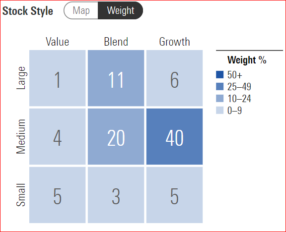
The Style Box (Weight)
- The Style Box was popularized by the financial services research provider Morningstar, Inc.
- Style box provides a graphical representation of investing categories for both fixed-income and equity investments. A style box is a valuable tool for investors to use when determining asset allocation.
- It allows informed comparisons and portfolio construction based on what funds actually hold, rather than assumptions based on a fund’s name or how it is described by its marketers.
- It also allows individual and professional investors to quickly understand the investment positioning of a mutual fund, by providing an easy-to-understand visual representation of fund characteristics.
What does the chart show?
A fund is an aggregation of individual stocks. The style of a fund is determined by the style assignments of the stocks it owns. By plotting all of a fund’s stocks on the stock style grid, the range of stock styles included in the fund immediately becomes apparent. An asset-weighted average of the underlying stocks’ style and size scores determines a fund’s placement in the Style Box.
Style Box is a nine-square grid that provides a graphical representation of the “investment style” of stocks and mutual funds.
The Style Box represents –
- Three stock investment styles for each of three size categories: small, mid and large. Two of the three style categories are “value” and “growth”
- The vertical axis is divided into three categories, which are based on market cap.
- The horizontal axis is also divided into three categories, based on valuation.
- The Style categories –Value and Growth are common to both stocks and funds. However, the third, central column definition differs.
- For funds, the central column of the Style Box will represent the blend style (a mixture of growth and value stocks or mostly core stocks).
*Source: Morningstar
How to interpret the chart?
- The numbers inside the boxes indicate – The %weight each style with the subsequent market cap is given in the portfolio.
- The maximum %weight decides the style of the fund.
- In the given chart, 40% of the stocks in the portfolio fall under growth in the mid-cap segment. This indicates that the fund overall is a “Mid-cap growth fund”
When to use the chart/ shortcomings?
- We can use the style box to classify funds based on their underlying holdings.
- It helps to construct portfolios based on the characteristics-the style factors-of all the stocks and funds that portfolio includes.
- Easy-to-understand visual representation of stock and fund characteristics.
- However, it fails to offer a complete picture of how the fund’s holdings are distributed and its peer comparison.
- Style box assignments for stocks are updated each month. Assignments for funds are recalculated whenever Morningstar receives updated portfolio holdings for the fund.
- Morningstar in its article mentions that – The Style Box cannot be used to pick a fund, it can only be used to check that the fund under consideration is adhering to its stated investment objective.
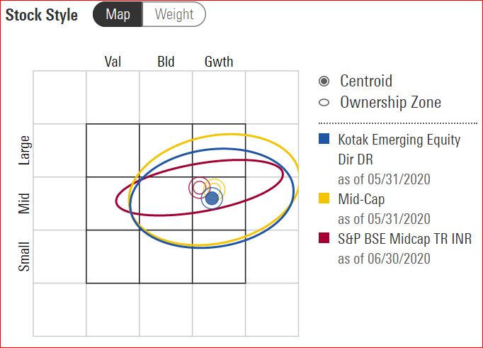
The Style Box (Map)
- The aim is to provide a complete picture of how the fund’s holdings are distributed and its peer comparison, which the style box (weight) fails to deliver. To overcome this hitch, Morningstar has developed a fund’s centroid and Ownership Zone.
What does the chart show?
Centroid:
- The point where size and value scores for a fund’s holdings intersect on the style box is the Centroid.
- The fund’s centroid represents the weighted average of all the fund’s holdings.
- The centroid’s position is used to assign a fund to one of the nine style-box-based fund categories
Ownership zones:
- Ownership Zones are the shaded area of the Style Box, intended to be a visual measure of a fund’s style scope – that is, the primary area of a fund’s ownership within the Style Box.
- It is derived by plotting each stock in the fund’s portfolio within the Style Box.
- It is centered around a centroid that is determined using an asset-weighted calculation.
- The shaded area represents the center 75% of the fund’s assets.
- It provides an intuitive visual representation of the area of the market in which the fund invests.
Chart
*Source: Morningstar
*Style box assignments for stocks are updated each month. Assignments for funds are recalculated whenever Morningstar receives updated portfolio holdings for the fund.
How to interpret the chart?
- The chart marks the centroids and ownership zones of the benchmark index (red), category (yellow) and the fund under study (blue).\
- It shows that the fund under consideration is adhering to its category by staying within the boundaries of the ownership zone of its category.
- The fund has a broader range than the benchmark index, however, all the three centroids are very close to each other and overlapping which confirms that the fund belongs to “Mid-cap growth” style.
When to use the chart/ shortcomings?
- Over a period of time, the shape and location of a fund’s or portfolio’s Ownership Zone varies. This movement is a good indicator of how consistent a fund’s style is.
- Observing where the Ownership Zone falls within the Equity Style box is useful because many funds which appear similar in size and style may actually include quite different security types. For example, it’s expected that a fund holding mainly large-cap growth stocks would behave differently than one containing both large-and mid-cap value stocks, yet both funds might be classified as large-cap growth.
- Conversely, you might discover that two funds in your portfolio have very similar centroids and Ownership Zones despite being in different categories and/or style boxes, and thus they could be redundant with one another.
The Style Box is a logical, completely integrated system and philosophy for stock and fund research, portfolio construction, and market monitoring. However, it’s important to remember that the style box is just a summary. It has its limitations like any tool, but if you know where to look, it’s possible to find quite a bit of useful information to supplement what a fund’s style box tells you.
Note by Morningstar: It’s important to note that a fund’s style box is not the same as its category. That can cause some confusion for funds in categories corresponding to the nine squares of the style box. Sometimes, the two will differ. The reason that such discrepancies can happen is that the style box is a snapshot of one moment in time, whereas fund categories are meant to be much more stable and consistent. Every time a fund releases a new portfolio, its style box is automatically updated to reflect that portfolio. That means that, in theory, a fund could move around in the style box several times in a single year. A fund’s category, on the other hand, generally stays the same unless there’s a pronounced shift in its portfolio or strategy. If a fund’s style box and its category have been consistently out of sync for three years or more, its likely to move the fund to a new category, though even then the change isn’t automatic.
Conclusion
We can analyse mutual funds in a detailed way using just the NAV history and holdings. The charts and ratios definitely give us a clue about how the funds have performed. However, they do not tell us WHY the funds have performed in that way, and therefore if they are likely to continue performing in that way. We will also need to look at qualitative analysis for that.


You must be logged in to post a comment.